


This is the first contents page I analysed

Firstly the contents page is structured using an unconventional asymmetrical grid with a sidebar, the creator used this structure because the sidebar allows text related to the contents to be viewed clearly and separately from the main features, in this case the welcoming message, regulars and information regarding subscription. Secondly the separation also allows the page numbers to be held within the bar separating the sidebar from the rest of the page giving the page a clear and professional appearance.
Furthermore the creator has also sectioned different content such as the ‘features’ and ‘regulars’ by placing them in different locations and putting headings of a different colour above each of them in order to allow the reader to differentiate between the two. Thirdly the contents page also features a main image of students and a teacher at the school in some sort of homemade looking race cars, the creator used this image because it would cause confusion for the reader because they would be wondering why there are students in race cars, making them interested and therefore more inclined to purchase and read the magazine.
Moreover the contents page uses a combination of both sans serif and serif font types, in order to differentiate different types of information, for example the ‘subscribe free to teachers’ is sans serif and ‘schools of the future’ article is serif. Furthermore all of the article headings are larger than the information below them in order to make it clear to the reader that they are indeed headings, also some of the headings are the colour red, this may be to emphasise the importance of the articles to the reader or because they are simply in a different category of news compared to the other articles. The text below the headings all consist of a short piece of information regarding the article, almost like a teaser or an insight into what each article is about in order to entice the reader and get them interested within the articles before they have even read them.
The theme of the contents page consists of a colour palette featuring a variety of different vibrant colours to emphasise headings and titles etc. and black text in order to make it contrast against the background making it clear and easy to read. Finally the type of language used throughout links to the fact that it is primarily aimed towards students of the school, with the use of direct address and articles that only members of the school will understand, making it more personal for the reader if they are a student, teacher or parent.
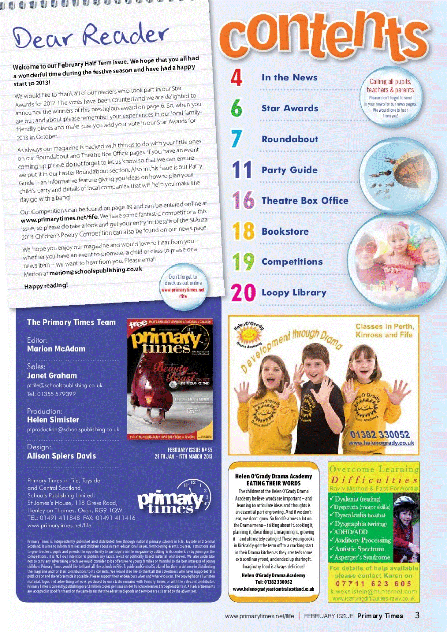
This is the second contents page I analysed
Firstly the contents page is structured using a conventional two column grid structure, in order to clearly separate and show the four sections within it, making it easy for the reader to understand and appear whilst also making it appear professional and highly detailed.
The first section is located in the top left and is titled as ‘dear reader’ this is direct address towards parents, making them feel welcomed and that the article they are reading is personal and written as a message directly for them regarding the school and their children.
Furthermore this part of the magazine appears to be written on a notepad and the serif text used makes it appear as if it was hand written which emphasises the point that this part of the page was made to make the reader feel as if it was personally written for them.
Moreover the language used Within the message is very direct and informative, in order to give the primary audience of the magazine ‘parents’ an insight into what’s occurring at the child’s school.
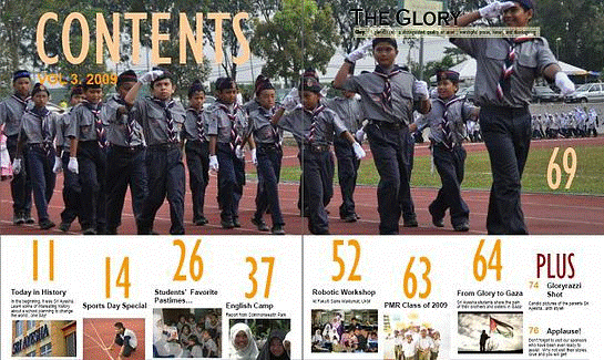
This is the third contents page I analysed
Firstly this contents page is spread over two pages, allowing for more space for the main image and information, however despite it being able to portray a lot of information it doesn’t take advantage of it therefore making it appear un-professional and dull.
Furthermore the contents page is also split into two separate sections, the top section displaying the main image and the bottom section displaying the page numbers, images and captions for each of the articles displayed alongside secondary images.
Additionally the editor also used supporting images relating to each article in order to provide the reader with a visual insight into what each article is about. In addition to this each of the images are anchored by them being supported by the page numbers and article titles, providing a small insight and narrative for each image which will further entice the reader to read the magazine. The word ‘glory’ connotes highly renowned, honourable and high achieving which represents the school as a professional institute that strives to be the best in terms of achievement and quality. The font type used is sans serif, making it appear bold, simple and to the point which furthers the representation of professionalism and seriousness within the school whilst also making different texts clear and easy to differentiate between. The overall theme comes across as serious and professional, which suggests that the magazine will be more informative rather than entertaining for example they only use three different colours throughout the page to make it clear for the reader rather than attractive.
Evaluation of contents page analysis
My analysis enabled me to identify tools that other school magazines used on their own contents pages and how they are effective. Therefore I shall use the tools that I found for example page numbers, in my own design for my school magazine contents page, in order to make it as effective and as high quality as possible. In addition each of the magazines I analysed used a variety of different conventions however each of them featured a main image, the main image used on each contents page was linked to the main article within the magazine with the use of a page number. I will apply this feature to my own contents page because I believe that it is effective in terms of enticing the reader to actually read through the magazine because of the interest caused by the main image. Moreover the first two magazines used their own personalised welcoming messages on their contents pages along with a clear colour scheme, they used both of these features because they both give the contents page a professional appearance, the professional appearance will reflect on the school as a whole and entice the reader to actually read through the magazine due to it looking high quality and either fun or serious. Moreover the greeting messages featured at the beginning of the first two contents pages I analysed make the reader feel welcome as they open the magazine which will be another enticement for the reader.
In addition to the main image there are also two smaller supporting images laid out below the main image, the fact the images are smaller and below the main image may suggest that they are less important than the main image, despite the two smaller images appearing less important they still feature on the same page as the main image implying that even though they are less important they are still newsworthy articles. Additionally all of the images have a page number beside them, anchoring them to a specific article within the magazine, and on the contents page where the reader can find out more about the story behind the image. The contents page also features a supporting graphic in the top left hand corner of the page, which appears to be an icon stating that this magazine is the 21st edition which furthers the professionalism of the magazine as a whole.
Additionally the text featured within this section is all darkly coloured due to the contrast it causes with the white background of the notepad, making it clear and easy to read for the user.
However dark colours used are not all the same, different colours are used to emphasise and differentiate different points for example the welcoming message is written in black whereas the rest of the general text other than contact details is written in grey.
The section in the top right hand corner of the page features the contents, the title of this section is written using a fun and quirky serif font type, in order to make it appear less serious and more fun which would appeal to children due to its fun looking appearance however it’s fun appearance will also appeal towards parents due to it having a representation on how the school is run and what it is like, which would be for their students to have fun.
Moreover the main image is of a group of students marching, the editor used this in order to represent the school as an institution that takes pride in what they do and that the students within it are unified.