


Firstly the masthead is distinctive and stands out due to it being red furthermore it also contrasts against the white back ground making it stand out even more. It is important for magazine editors to ensure that the masthead stands out because when a magazine is on a shelf, the first thing that catches the eye of the potential buyer is the title therefore if it stands out compared to other competitive magazines it is more likely to be purchased.
The background shows three students that attend the school playing netball, this promotes the school as a social and sporty institute where students are interactive and work and play with one another. Moreover this implies that the school is about more than just education and academic work and that they want to show that they care their students and activities within the school such as sport.
In addition the facial expression of the student in the centre connotes happiness showing how students enjoy being at the school and therefore gives a good first impression on the reader regarding the school before they have even read the contents of the magazine.
The secondary image is being anchored by the condensed contents page on the front cover which allows the reader to have an insight into the contents of the magazine before even reading through it.


Firstly the style of the masthead in this magazine is different to the first magazine. The first magazine is laid out clearly and distinguishes itself from the rest of the front cover however the masthead of this magazine makes it difficult to differentiate the different features on the front cover, for example the title and tagline, this could confuse readers and therefore be a deterrent when it comes to the initial purchase of the magazine.
Even though the makers of this magazine haven’t used the space efficiently and have squeezed together different features they portrayed them differently in order to distinguish them from one another for example they have used different font sizes, colours and serifs for example the name of the magazine “independent school” is sans serif which connotes how the school is serious, professional and straight to the point, whereas the “parent” is seriff as well as direct address for their demographic of parents the editor used both these techniques in order to entice parents to read the magazine as well as give it a sophisticated and professional appearance.
The main image is a mid-shot of a girl and a student who attends the school being represented in the magazine, the reader can decipher this due to her being in uniform, the fact she is in uniform symbolises that the school is a smart and sophisticated institute with structure, this would appeal to the demographic if they are wanting to send their child to a prestigious and high achieving school.
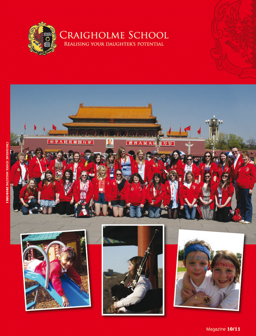
The masthead of this magazine cover is different compared to the previous two, because the previous two used a large eye catching typography whereas this magazine simply states their name and slogan, this could be due to the school having loyal readers therefore there is no reason to make their front cover appear attractive and enticing because it makes no difference to the demographic regarding whether or not they purchase the magazine.
Moreover the main colour used is red this could connote to the reader, passion regarding how passionate the school is at being the best it can be. The colour red can also connote leadership meaning that the school is an institute with structure, is run well and is an example of what other school should strive to be like. The type of font they have used for the name of the school is serif; this is predominantly used to make something appear professional and of worth, therefore the target audience of this school magazine could be sophisticated, wealthy individuals who want to send their children to a professional place of learning.
This is the second front cover i analysed
This is the third and final front cover I analysed
This is the first front cover i analysed
Evaluation
My analysis enabled me to identify tools that other school magazines used which are effective. Therefore I shall use the tools that I found for example a mast head, in my own design for my school magazine front cover in order to make it as effective and as high quality as possible. In addition each of the magazines I analysed used a variety of different conventions however each of them featured a main image regarding the school, typically a student or a group of students. Moreover each of the magazines put their own slogan on the front cover along with a clear colour scheme, they used both of these features because it gives the front cover a professional appearance which will reflect on the school as a whole and entice the reader to actually read through the magazine due to its attractive appearance.
Furthermore the first front cover I analysed showed a secondary image which is anchored by the cover lines on the front page, this is a useful tool as it gives the reader an insight into what they are purchasing, I might use this tool on my own magazine front cover in order distinguish it from other competitive magazines due it being an unconventional feature, making my magazine appear unique. In addition I feel that in order for a magazine cover to come across as professional it needs to be well organised, simple and uncluttered, I feel that the first two magazine front covers do this effectively however the third one is too simple making it look plain, boring and unprofessional therefore I must ensure that on my own front cover I apply a similar quantity of features as the first two front covers I analysed. Finally my target audience is students and parents at the school therefore in order to appeal to the target demographic I will use images of the school and the students within it as well as promoting articles on the front cover that are relevant to the school.
Furthermore the front cover is laid out unconventionally however it is still effective because readers can clearly see all of its features with ease. I am unsure if revealing the contents on the front cover of the magazine is effective therefore I will have to do research on more popular and better established magazines to see if they use this tool and if it is effective. The main image was taken using a low angle shot making the pupils appear important, this symbolises how the school has a strong student focus and only wants what is best for them.
The girl chosen to be the main image, can be depicted by the reader as a hardworking and successful student that attends the school, the reader can denote this due to her collar showing several badges that suggest she gets awarded for her academic work and achievements within the school, parents could see the student as a role model for their children and could want them to aspire to be as successful as her in their own academic endeavours.
This magazine front cover has used a puff in the bottom left hand corner of their front cover this is a good feature because it entices the reader to purchase the magazine, I will use this feature on my own front cover because I think it is a good tool to use when it comes to enticing the reader.
The layout of the magazine is somewhat messy and doesn’t have a particular order to it, for example there is nothing that really makes the magazine appear like a magazine because there are no elements or conventions suggesting that it is a magazine, this could confuse the readers because it almost appears as a leaflet or poster. Furthermore there are no side bars, pugs/puffs, contents, sub headings; these are the key components that the magazine is missing from the front cover therefore I will ensure to add all of these different features in order to make my product appear professional and as it should be.